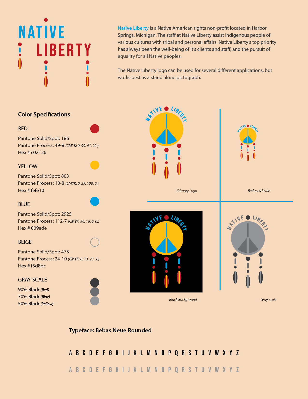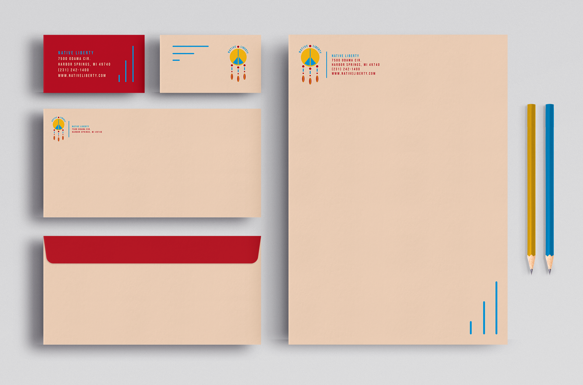
Native Liberty is a fictitious non-profit organization with a focus on assisting native peoples. A stationery system and identity sheet were created to accompany the brand and its concept. All pieces of the stationery system follow brand guidelines set in the identity sheet, such as colors and typefaces.
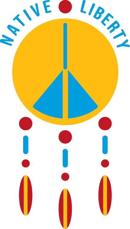
Research is a fundamental aspect of my design process and the first step in conceptualizing the Native Liberty brand. Many similar organizations logos feature the Medicine Wheel in some form and various script typefaces. The Medicine Wheel symbolizes the four seasons as well as the Four Directions (White/North, Black/East, Red/South, Yellow/West). My approach with the Native Liberty brand was to use these colors as a foundation, while introducing blue, as it is often seen in Native American dance regalia.
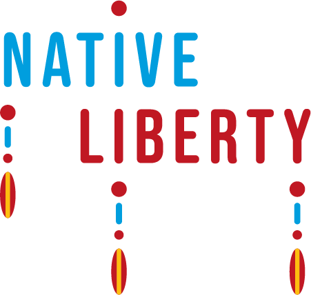
Keeping the design recognizable, I implemented the dreamcatcher into Native Liberty’s logo design. To create a more modernized logo compared to its contemporaries, I simplified the dreamcatcher silhouette and hid a peace symbol within it. The solution to my initial research was to design an identity with color and personality that stands out.